
Project Overview
The product:
An app that will make it easy to find movie-trailers, save them, rate them for further review, see critic reviews, and order tickets to a movie theatre, all without leaving the app.
Project duration:
October 2022 – February 2023
The problem:
There are many services that show trailers, but there is nothing that combines all the services of reviewing, rating and purchasing tickets quickly in one app.
The goal:
Find an easier way for users to find movies and quickly place orders in the app, and find a theatre close to them. I wanted to make sure that the ordering stage was easy to navigate and easy to understand.
My role:
Lead UX Designer, UX Researcher, and Visual Designer.
Responsibilities:
User Research, Paper and Digital Wireframing, Prototyping, and Visual Design.

Understanding the user
● User research
● Personas
● Problem statements
● User journey maps

User research: summary
There can be challenges in finding movie trailers quickly, I want to identify them and help users find what they are looking for quickly and intuitively.
Understanding the pain points and frustrations users commonly have when using similar products, and understanding common user behaviours, I was able to develop an elegant solution.

User research: pain points
1. Time
Users would like to search movie-trailers quickly to find a movie they would like to watch.
2.Work/Life Balance
Trailers need to be easily found, rated and sorted. Purchasing tickets must be quick and easy.
3. Accessibility
Accessibility options should be used through the device and not through the app.

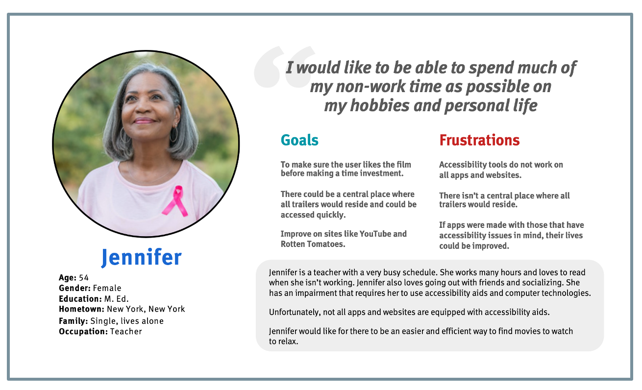
Persona: Jennifer
Problem statement:
Jennifer is a Teacher with a visual impairment who needs an easier way to watch and find movies because she has limited time.

User Journey Map
Persona: Jennifer
Goal: Make sure she likes the movie before making the time investment
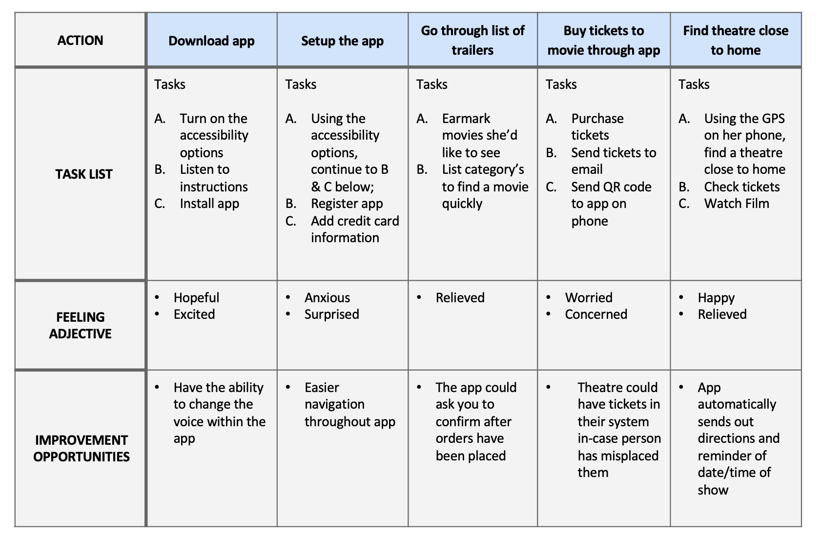
Mapping Jennifer's User Journey Map clearly showed how helpful it would be to have a Movie Trailer App with strong accessibility options.

Starting the design
● Paper wireframes
● Digital wireframes
● Low-fidelity prototype
● Usability studies

Paper wireframes
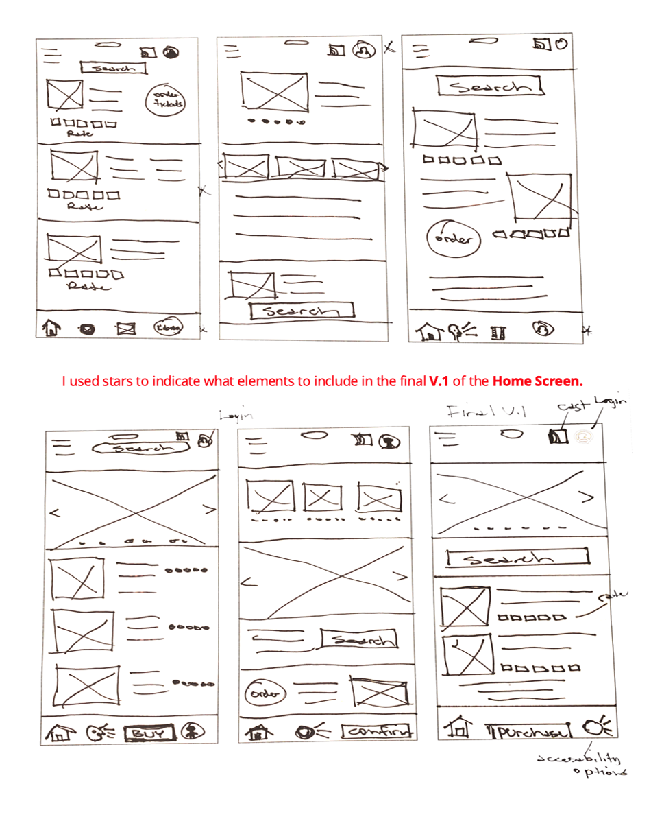
I drafted several iterations of the app to address pain points, and carried through elements that helped to create a smooth user journey as shown in the digital wireframes.

Digital wireframes
At the 1st digital wireframe phase, I made sure the research findings were used to create the initial screens.

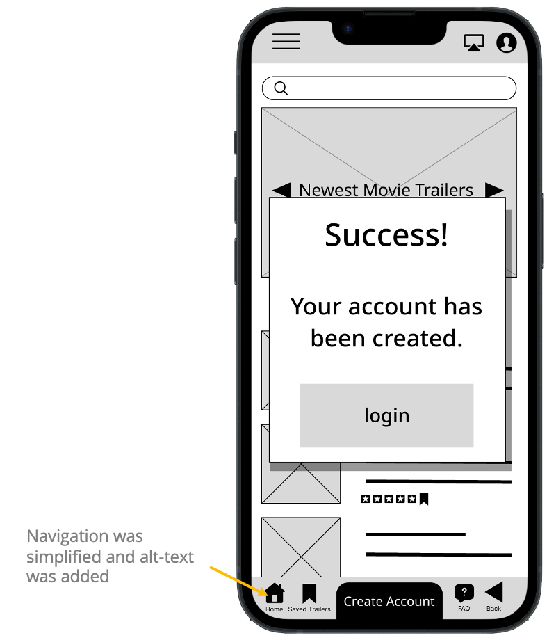
I used icons, and alt-text, to make navigation clearer and to make better use of screen readers for assistive technologies.

Low-fidelity prototype
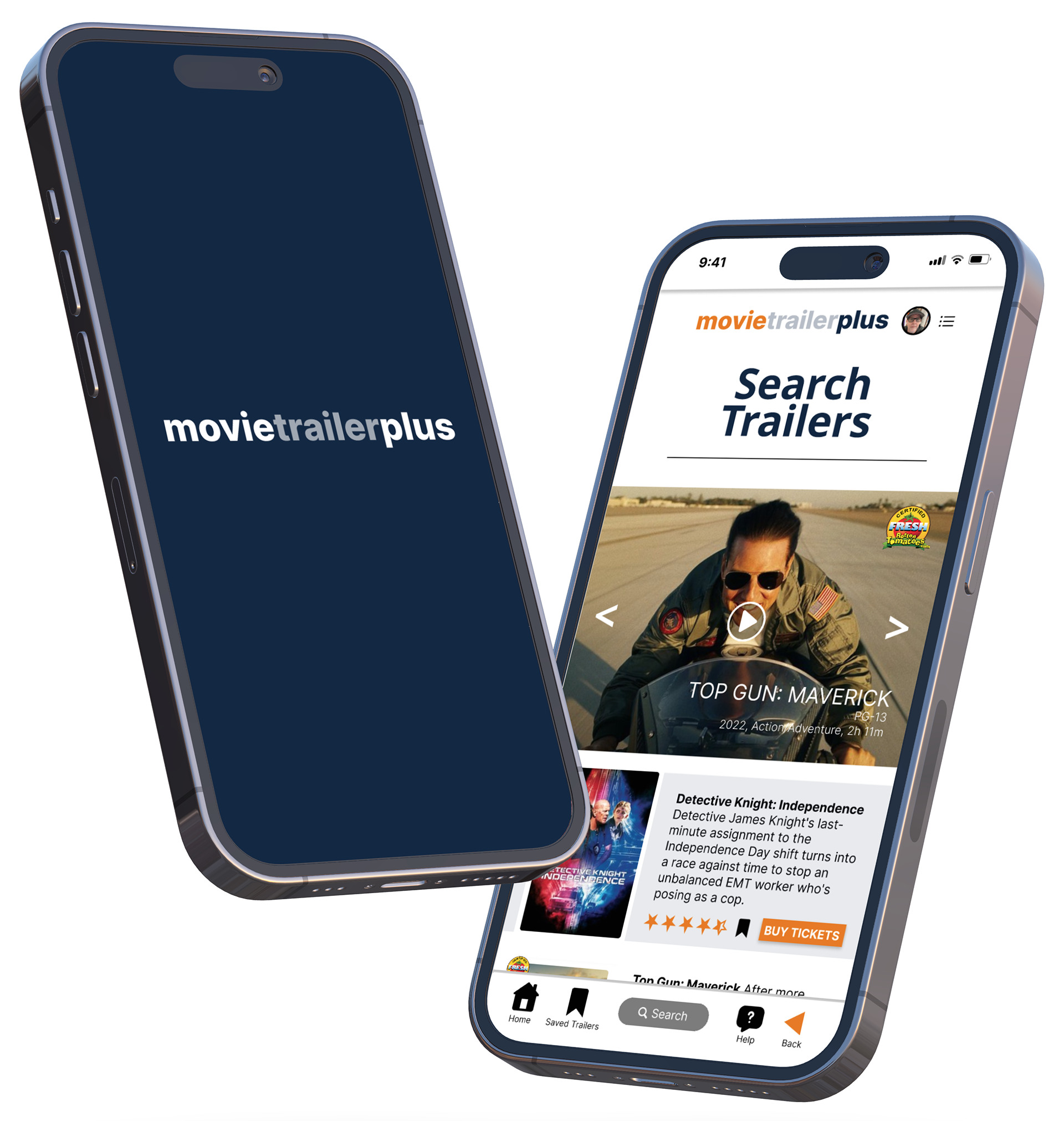
This is a screenshot of my Movie 1st Trailer Prototype.
First prototype
~
Below is a link to the Movie App prototype after latest research data was synthesized. The prototype was changed to reflect new usability data.
Updated prototype after changes (December 20, 2022).

Usability study: findings
I conducted two usability studies.
The first consisted of wireframe mock-ups to help guide the user through the user flow, from wireframes to low fidelity mock-ups.
The second study used a high-fidelity prototype to further refine the product design, making it easier to use the product and provide valuable insight as to what the user requires for a smooth user flow.

Round 1 findings
1. The app should be streamlined and more universal.
2. Users identified valuable insight into what will make the app better for them.
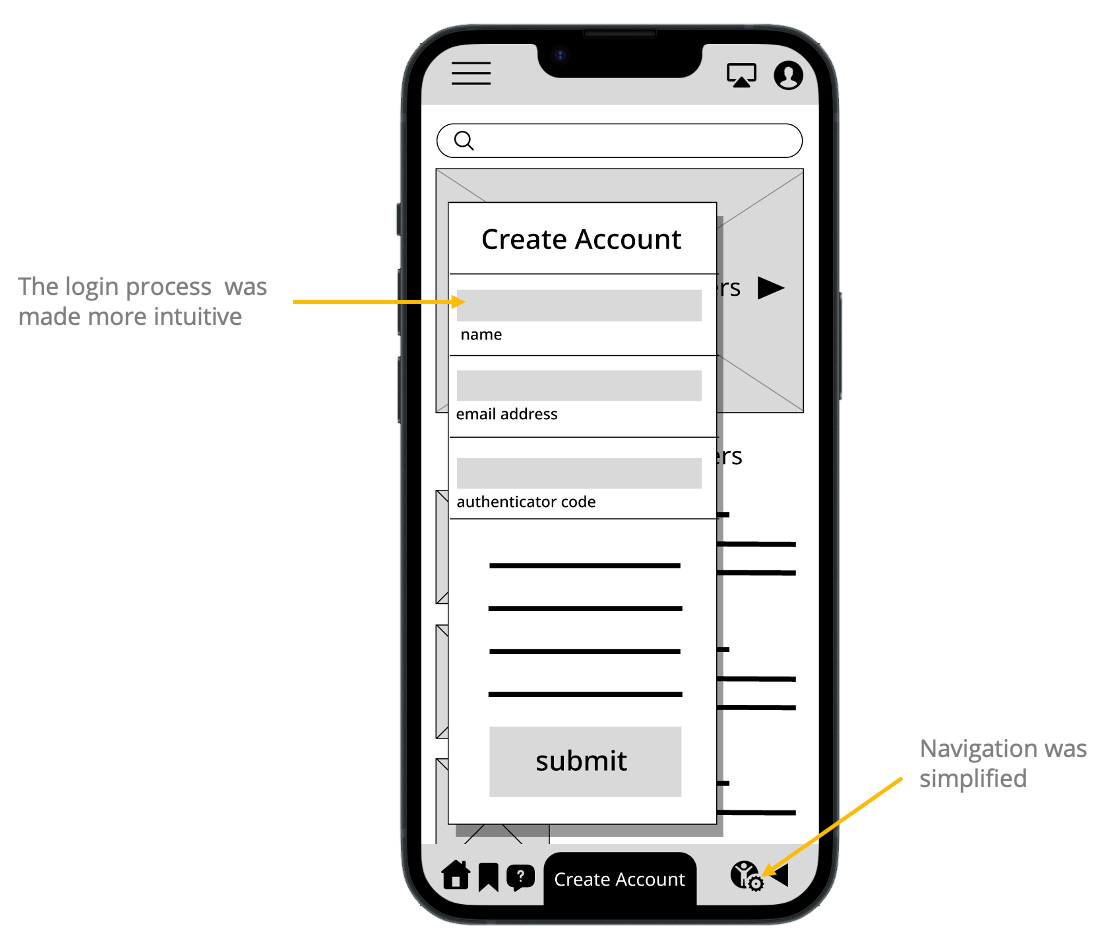
3. I should use icons and alt-text to make navigation clearer, and to make better use of screen readers.
Round 2 findings
1. Add a ”Critic’s Rating" or "Certified fresh" style rating to the trailer pages.
2. Change the FAQ page and make a “Help” section instead.

Refining the design
● Mockups
● High-fidelity prototype
● Accessibility

Mockups
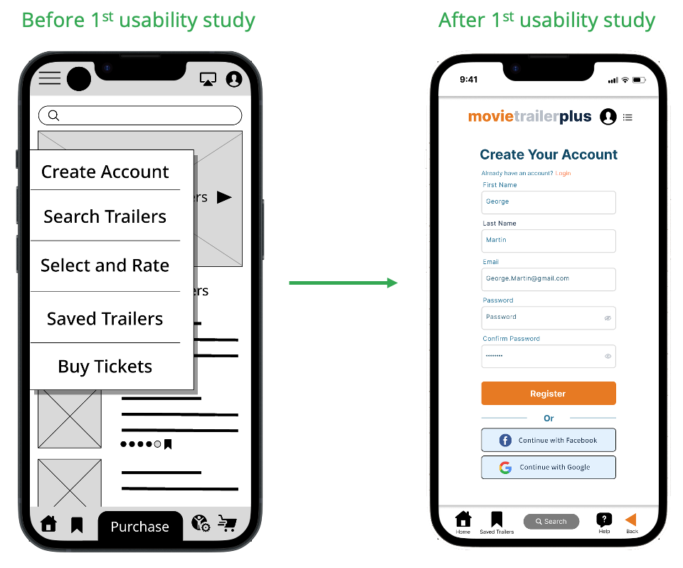
After creating the first mock-up of the Movie Trailer App, I conducted my first usability study.
Some users expressed the need for a more universal user flow, so I changed the design.
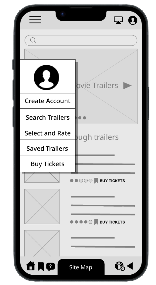
I developed a more streamlined flow which allowed the user to easily access all the features of the app within a few clicks, and create or login to an existing account more easily.

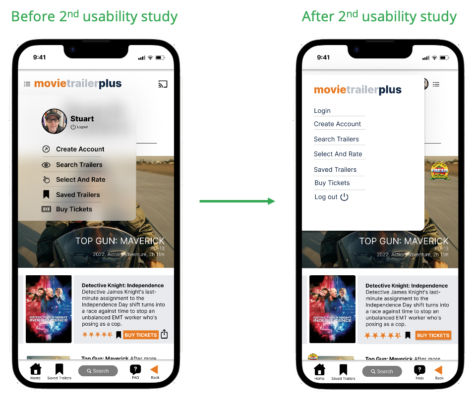
In the second usability study, I found that participants needed some more refining of the user flow, and to introduce a rating system for films. As Rotten Tomatoes is universally accepted, we introduced their rating system to our app. This was achieved by cleaning up the navigation menu, creating a cleaner and more universal design, and working with Rotten Tomatoes.
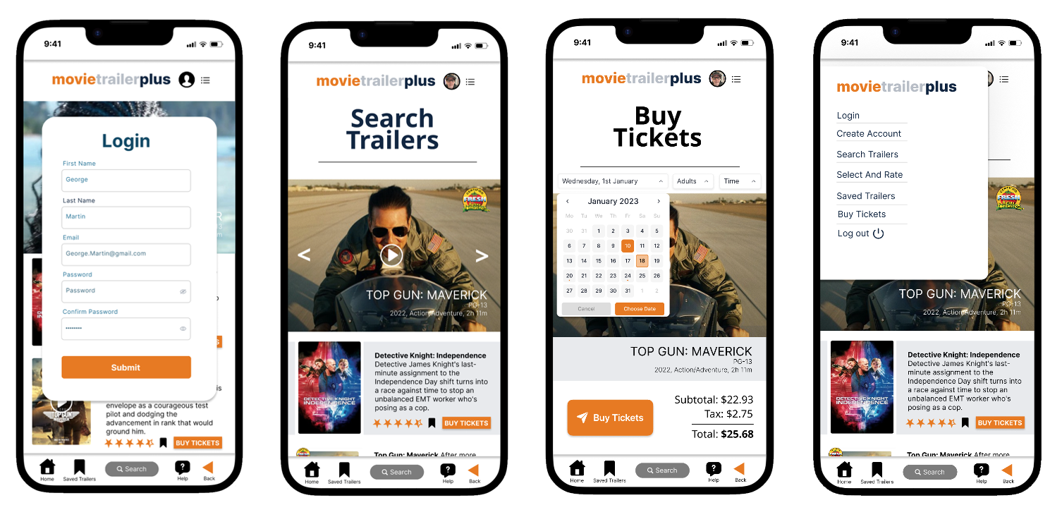

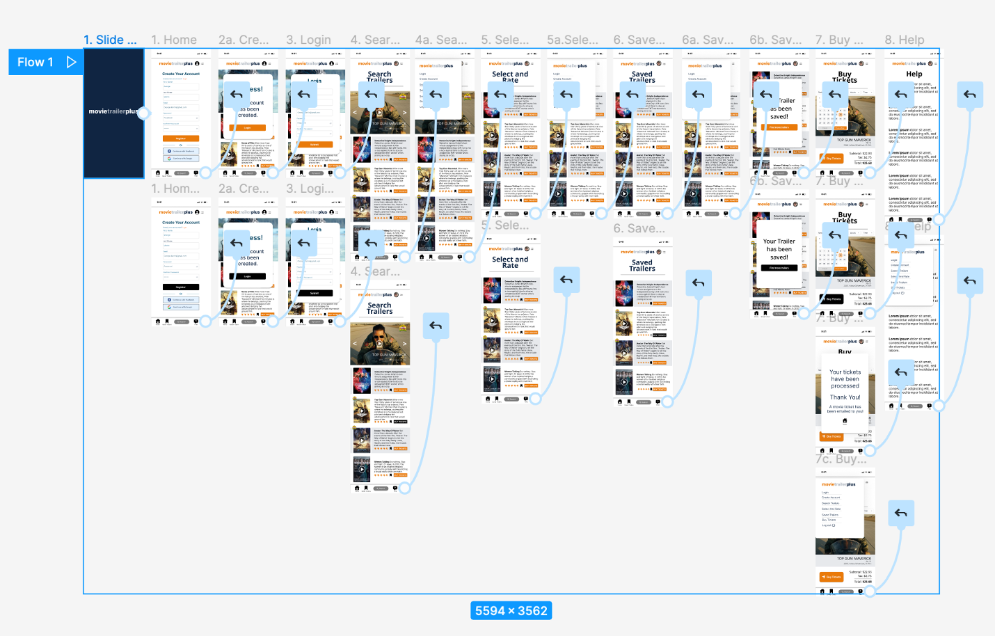
High-fidelity prototype
In the final high-fidelity prototype, I presented a much cleaner user flow allowing users to easily find trailers, search them, rate them, and buy tickets to theatres close to them.
Please view the “movie trailers plus” app

Accessibility considerations
1. We used alt-text and icons for the use of screen readers to make the app accessible to all of our users.
2. Screen readers and other assistive devices often make alternative resources less necessary. I made sure our app worked with technologies already built into mobile devices.
3. High-contrast screens were also used to help make the app more accessible. The use of icons, colour and gestures were top of mind to assist our users.

Going forward
● Takeaways
● Next steps

Takeaways
Impact:
The app makes it easy for users to quickly find movie trailers, rate them, save them and purchase movie tickets near their location.
A quote from peer feedback: “This is awesome, a lot of thought went into the process. Very nicely done!
What I learned:
Through designing this app, I learned different ways to conduct various studies, synthesize the data, ideate from real world findings, all while taking into account biases and accessibility concerns.

Next steps
1. Continue to add new features to the app, conduct new usability studies to determine any pain points, and receive user feedback to improve the product further.
2. After synthesizing the new user data, I will look for more ways to implement and improve the app.

Let’s connect!
Thank you for your time reviewing Movie Trailers Plus.
Please email me at (artguy6@gmail.com) or contact me directly!
